Value Finder analysis
Every Value Finder simulation populates a dataset, the pyValueFinder dataset. This dataset contains a lot more information than is what is currently presented on screen.
The data held in this dataset can be analysed to uncover insights into your decision framework. This notebook provides a sample analysis of the Value Finder simulation results.
In the data folder we’ve stored a copy of such a dataset, generated from an (internal) demo application (CDHSample). To run this notebook on your own data, you should export the pyValueFinder dataset from Dev Studio then follow the instructions below.
This is how Value Finder results of the sample data are presented in Pega (8.6, it may look different in other versions):
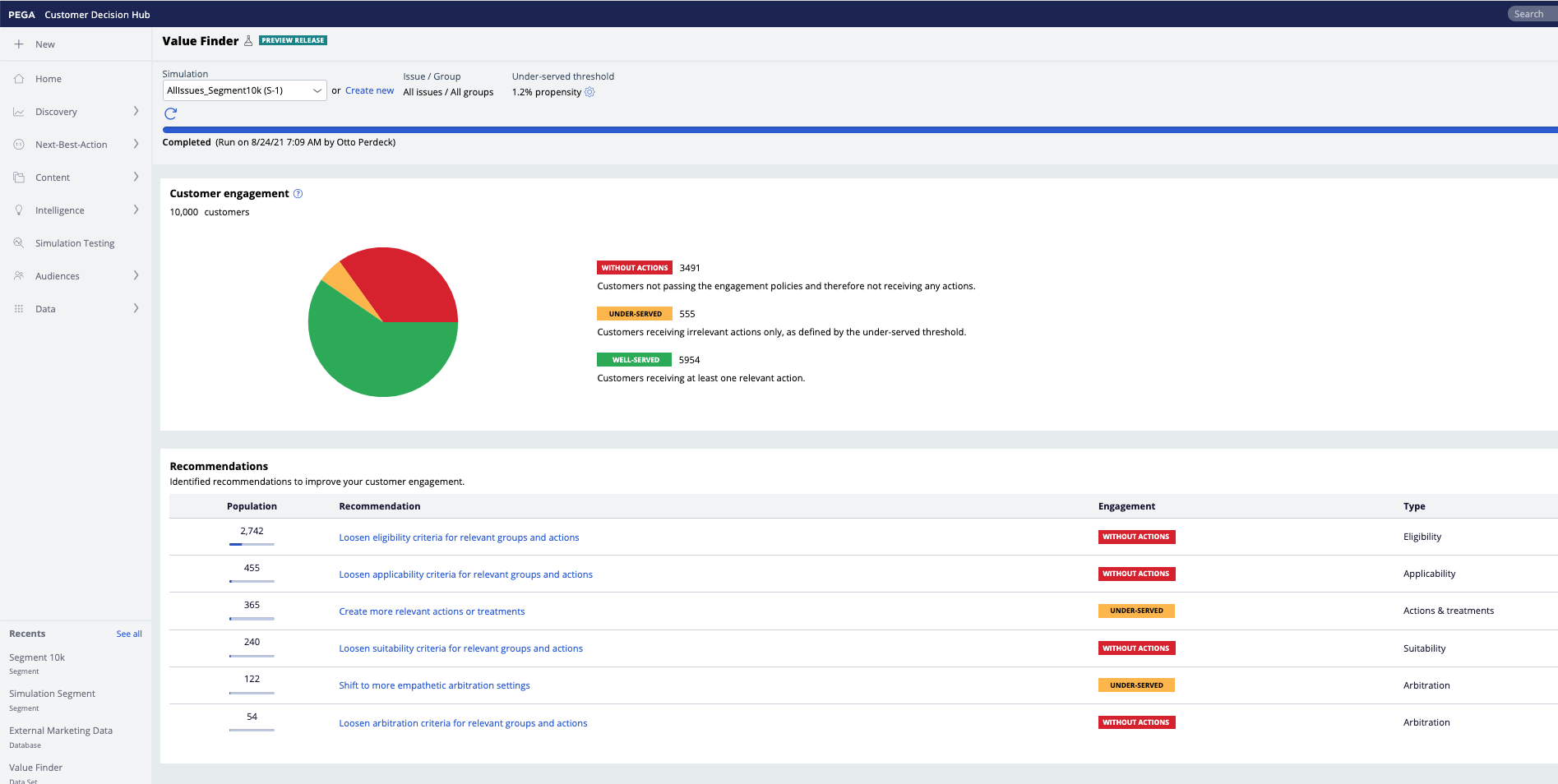
For the sample provided, the relevant action setting is 1.2%. There are 10.000 customers, 3491 without actions, 555 with only irrelevant actions and 5954 with at least one relevant action.
PDSTools defines a class ValueFinder that wraps the operations on this dataset. The “datasets” import is used for the example but you won’t need this if you load your own Value Finder dataset.
Just like with the ADMDatamart class, you can supply your own path and filename as such:
vf = ValueFinder(path = '[PATH TO DATA]', filename="[NAME OF DATASET EXPORT]")
If only a path is supplied, it will automatically look for the latest file.
It is also possible to supply a dataframe as the ‘df’ argument directly, in which case it will use that instead.
[37]:
from pdstools import ValueFinder, datasets
import polars as pl
#vf = ValueFinder(path = '...', filename='...')
vf = datasets.SampleValueFinder()
When reading the data, we filter out unnecessary data, and the result is kept in the df property:
[38]:
vf.df.head(5).collect()
[38]:
| pyStage | pyIssue | pyGroup | pyChannel | pyDirection | CustomerID | pyName | pyModelPropensity | pyPropensity | FinalPropensity |
|---|---|---|---|---|---|---|---|---|---|
| cat | cat | cat | cat | cat | str | str | f64 | f64 | f64 |
| "Applicability" | "Sales" | "DepositAccount… | "SMS" | "Outbound" | "Customer-1" | "StudentCheckin… | 0.269231 | 0.269231 | 0.278077 |
| "Applicability" | "Usage" | "Mobilebanking" | "SMS" | "Outbound" | "Customer-100" | "GetTheUMobileA… | 0.5 | 0.5 | 0.713095 |
| "Applicability" | "Collections" | "Recommendation… | "SMS" | "Outbound" | "Customer-1000" | "SetupAutopayTo… | 0.5 | 0.5 | 0.421306 |
| "Applicability" | "Sales" | "DepositAccount… | "SMS" | "Outbound" | "Customer-10000… | "StudentCheckin… | 0.269231 | 0.269231 | 0.244777 |
| "Applicability" | "Sales" | "Bundles" | "SMS" | "Outbound" | "Customer-1001" | "StudentChoice" | 0.15 | 0.15 | 0.24831 |
The piechart shown in platform is based on a propensity threshold. For the sample data, this threshold follows from a propensity quantile of 5.2%.
The plotPieCharts function shows the piecharts for all of the stages in the engagement policies (in platform you only see the last one) and calculates the threshold automatically. You can also give the threshold explicitly.
[39]:
vf.plotPieCharts()
#vf.plotPieCharts(method = "threshold", th = 0.30)
Hover over the charts to see the details. For the sample data, the rightmost pie chart corresponds to the numbers in Pega as shown in the screenshot above.
Red = customers not receiving any action
Yellow = customers not receiving any “relevant” actions, sometimes also called “under served”
Green = customers that receive at least one “relevant” action, sometimes also called “well served”
With “relevant” defined as having a propensity above the threshold. This defaults to the 5th percentile.
Insights into the propensity distribution per stage is crucial. We can plot this distribution with plotPropensityThreshold. You often see a spike at 0.5, which corresponds to models w/o responses (their propensity defaults to 0.5/1 = 0.5).
The dotted vertical line represents the computed threshold.
[40]:
vf.plotPropensityThreshold()
These different propensities represent
pyModelPropensity = the actual propensities from the models
pyPropensity = model or random propensity, depending on the ModelControl (or, when models are executed from an extension point after the standard Predictions, their propensity, but such a configuration is not supported by Value Finder)
FinalPropensity = the propensity after possible adjustments by Thompson Sampling; Thompson Sampling basically smoothes the propensities, you would expect any peak at 0.5 caused by empty models to be smoothed out
We can also look at the propensity distributions across the different stages. This is based on the model propensities, not any of the subsequent overrides:
[41]:
vf.plotPropensityDistribution()
The effect of the selection of the propensity threshold on the number of actions for a customer can be simulated by supplying three arguments to the plotPieCharts() function: start, stop and step. By default, these correspond to the propensity thresholds, but can also correspond to the quantiles with the ‘method’ argument. In the background, this will generate the aggregated counts per stage, which we can plot as such:
[42]:
vf.plotPieCharts(start=0.01, stop=0.5, step=0.01)
The further to the left you put the slider threshold, the more “green” you will see. As you raise the threshold, more customers will be reported as getting “not relevant” actions.
The same effect can also be visualized in a funnel. Use plotPropensityDistributionPerThreshold() to show the threshold on the x-axis. By default, it considers the threshold as the propensity threshold value, but if you supply the method parameter to be 'quantile', then it will calculate the threshold from the quantile.
[43]:
vf.plotDistributionPerThreshold()
[44]:
vf.plotDistributionPerThreshold(method='quantile')
You can zoom in into how individual actions are distributed across the stages. There usually are very many actions so this typically requires to zoom in into one particular group, issue etc.
In the sample data, we can filter to just the Sales actions as shown with the ‘query’ functionality below (and this snippet may not work when using your own data if there is no Sales issue).
Use the plotFunnelChart() function for an overview of this funnel effect throughout the stages. As a rule of thumb, if there are only a few actions in each stage, this is not a good sign. If certain actions are completely filtered out from one stage to the next, it may also be a warning of strong filtering.
[45]:
vf.plotFunnelChart('Action', query=pl.col('pyIssue')=='Sales')
The above chart shows the funnel effect at the level of individual Actions. You may want to start more course-grained as shown below, by setting the level parameters as 'Issue':
[46]:
vf.plotFunnelChart('Issue')
Or just the groups for the Sales issue (again: this example may not work when using your own dataset if there is no Sales issue):
[47]:
vf.plotFunnelChart('Group', query=pl.col('pyIssue')=='Sales')